As innovation explodes across our industry, advisors like you are faced with more: More fintech platforms. More capabilities within those platforms. More connections between platforms. More data sharing. More training. More events. More content. More options.
Sometimes more isn’t always better.
Sometimes what innovation really needs is space. A step back. A chance to remember where — and why — we started.
Orion was born from the desire to help advisors work more efficiently. And when we started, we did that by generating reports for our clients. We had no apps at all. No user interface. No compliance suite.
Then we realized we could help with billing — so we built a Billing tool. And so on — trading, compliance, business intelligence, etc. — until we had solutions to simplify and streamline every single facet of our advisors’ work.
In order to continually improve on our promise to help you operationalize your vision for success, it was time to reimagine our own work: the way we approach innovation, the way we drive productivity, the way we empower you to deliver the best possible experience for your clients.
To help you win, we disrupted ourselves — and completely reconceptualized one of the most critical features of our technology: our user interface and experience.
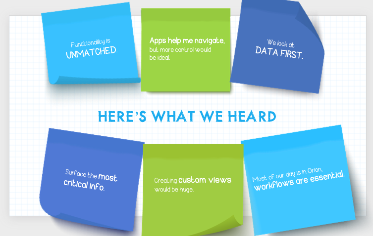
We didn’t do it alone. After all, our advisors — you — are the heartbeat of Orion. So to better understand what you needed, we asked. We recruited and interviewed a focus group of 20 participants, representing a number of different financial businesses and roles within the industry. We surveyed over 100 users of our platform, and ran analytics to understand the behavior of thousands more.
Apps were still an intuitive way to navigate our solutions, but with a more flexible, customizable layout, advisors could more easily surface the tasks and workflows that matter most to their days. A seamless flow of information through the platform would make advisors more productive, while control over the homescreen view itself would allow advisors to better prioritize their daily tasks.
Armed with this intelligence, we went, quite literally, back to scratch — with pen and paper, sketching out what our home screen experience could become. We used the power of simplicity to clear the noise — the more — advisors were experiencing, and design a space for them to easily see, analyze, and act on needs and opportunities in their businesses.
And we created the reimagined Orion Connect.
Your new home screen is the command center for your day, and it’s entirely customizable at the admin, firm, or rep level. That flexibility allows you to decide what you see first as your day begins — and empowers you to take quick action on items that need immediate attention.
With the new Orion Connect experience, you're able to:
- Enhance productivity by running reports and adding new accounts right from the home screen
- Access client data faster with a simple search function that opens account summaries, goals, allocation details, and performance information
- Stop jumping between apps with a contextual sign on to the Client Portal
The new Orion Connect is a better way to start and manage your day.
Ready to see the new Orion Connect in action? Click here to watch a quick video and take a closer look at the new interface.
Want to get started right away? Great! Schedule a short demo with our team today!
0379-OAS-2/18/2020
